

“Hey, look, over there!”
“What is it?”
“It’s a Marvel book!”
“No, no, can’t be. It’s only one book! Marvel doesn’t DO “one book”s anymore. If its not worth printing six times a month, then its not worth printing at all!”
Yes, I jest a bit. Anyone who knows me knows I’ve been…well, let’s just say I’ve been a bit down on Marvel these past few months. Who can blame me? They’ve been loud, obnoxious, arrogant, and generally unpleasant for both retailers and customers to deal with. Their books have been printing two and three times a month – at $3.99 a pop in many cases – often at the vast expense of quality. All their books have been steadily splitting in half, or even further – Avengers becomes Avengers, New Avengers, Secret Avengers, Avengers Academy, and now Avengers Assemble. X-Men becomes X-Men, Uncanny X-Men, Astonishing X-Men, X-Men Legacy, and Wolverine and the X-Men. Captain America becomes Captain America, Captain America and Bucky, and Winter Soldier. Fantastic Four becomes Fantastic Four and FF. Thor becomes Mighty Thor and Journey into Mystery. You get the picture. And all those point one issues! All this, combined with the quality of the material their competition has been putting out recently (not to mention their competition’s attitude towards fans and retailers), and its completely understandable as a fan why people have been abandoning their Marvel books in droves, even while its very frustrating from a retail standpoint.
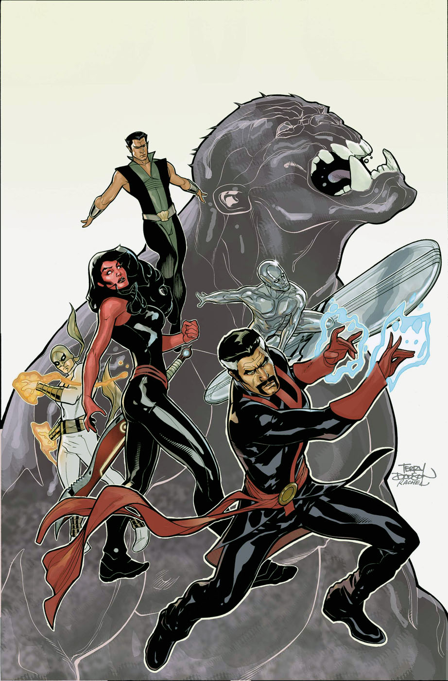
So then, with all this in mind, I open up Marvel Previews a few months back and see that they’re doing a new Defenders book. Now, I love the Defenders. Or, rather, more specifically, I love the Silver Surfer, and he has generally been a member of the Defen ders, and thus I love that team. And, this new incarnation of the team was going to be very similar to the classic lineup, including the Surfer. I looked at it, and I sighed, because it was going to be the first Surfer book in about 14 years that I wasn’t going to be picking up. It didn’t help matters that Matt Fraction was going to be writing the book – his run on Iron Man was excellent, but I didn’t much care for his Thor run, and Fear Itself was pretty awful in my opinion. So I put the book at the back of my mind, until last month when the first issue came out.
Of course, being in essence a Surfer book, I had to at least give it a faint shot, even though I’ve been trying hard to completely cut the Marvel out of my life. Flipping through it, I was unimpressed – I generally like Terry and Rachel Dodson’s art, but on first glance, this just looked bland and uninspired. Then I went ahead and read through the book, though, and upon finishing it, I immediately went up front and added it to my pull list. This, I thought to myself, is what I’d like to see more of in a Marvel book. If I had to describe it in one word, that word would be snappy. In tone, it reminded me a lot of the first issue of Keith Giffen and JM DeMatteis’ run on Justice League in the 80s, and in content, it was clear that this was Marvel’s answer to DC’s immensely popular Justice League Dark. This was Defenders as it should be – a team of lovable misfits, brought together not because they like each other, or out of a sense of duty, or even because they’re being handsomely rewarded for doing so. They’re brought together because the Avengers are busy, the X-Men are fighting each other again, the Fantastic Four are off in another dimension, and if somebody doesn’t take care of this cosmic threat, then the Earth blows up, and then EVERYBODY has a bad day.
Now, going back to my point about being unimpressed with the artwork – it wasn’t, in fact, that it was bad. I tried to figure this out after I read it, because I’ve been recommending the book to anyone who’ll listen over the past few weeks, and, almost uniformly, they picked it up, flipped through it, then put it back down. On a second look, it wasn’t that the Dodson’s had underperformed – their signature style was fully intact, and looked as good as it ever did. The problem actually lay in the coloring – and I do believe this is the first time I’ve ever blamed a book’s failure solely on the coloring. But its true – the colors in Defenders are extremely muted and monochromatic, even with brightly colored characters like the Hulk and Red She-Hulk inhabiting the pages.
 This is exacerbated by the fact that its a very busy book. Lots of scenes of action and destruction, and the muddled colors just make it look unappealing.
The second issue just came in yesterday, and I had a chance to read it just prior to starting this, and while the book hasn’t entirely found its feet yet (we are, after all, just two issues in), its shaping up nicely, and if Fraction can keep the momentum going, and Marvel can hire a new colorist, then they might have a winner on their hands. Of course, if its successful, I’m sure we’ll end up with West Coast Defenders and Defenders Academy ongoing’s here before long, but that’s a rant for another day.
Long story short, if you’re one of the ones who picked up the first issue of Defenders, flipped through it, then put it back down, or if you’re one of those who just refuses to even look at Marvel number one’s anymore, then I strongly urge you to give Defenders a second look. If you’ve ever wondered what the Silver Surfer would taste like if he were made of snow, or if you’re curious as to just how much of a creepy old man Dr. Strange can be when he wants to, then you won’t be disappointed.
.